
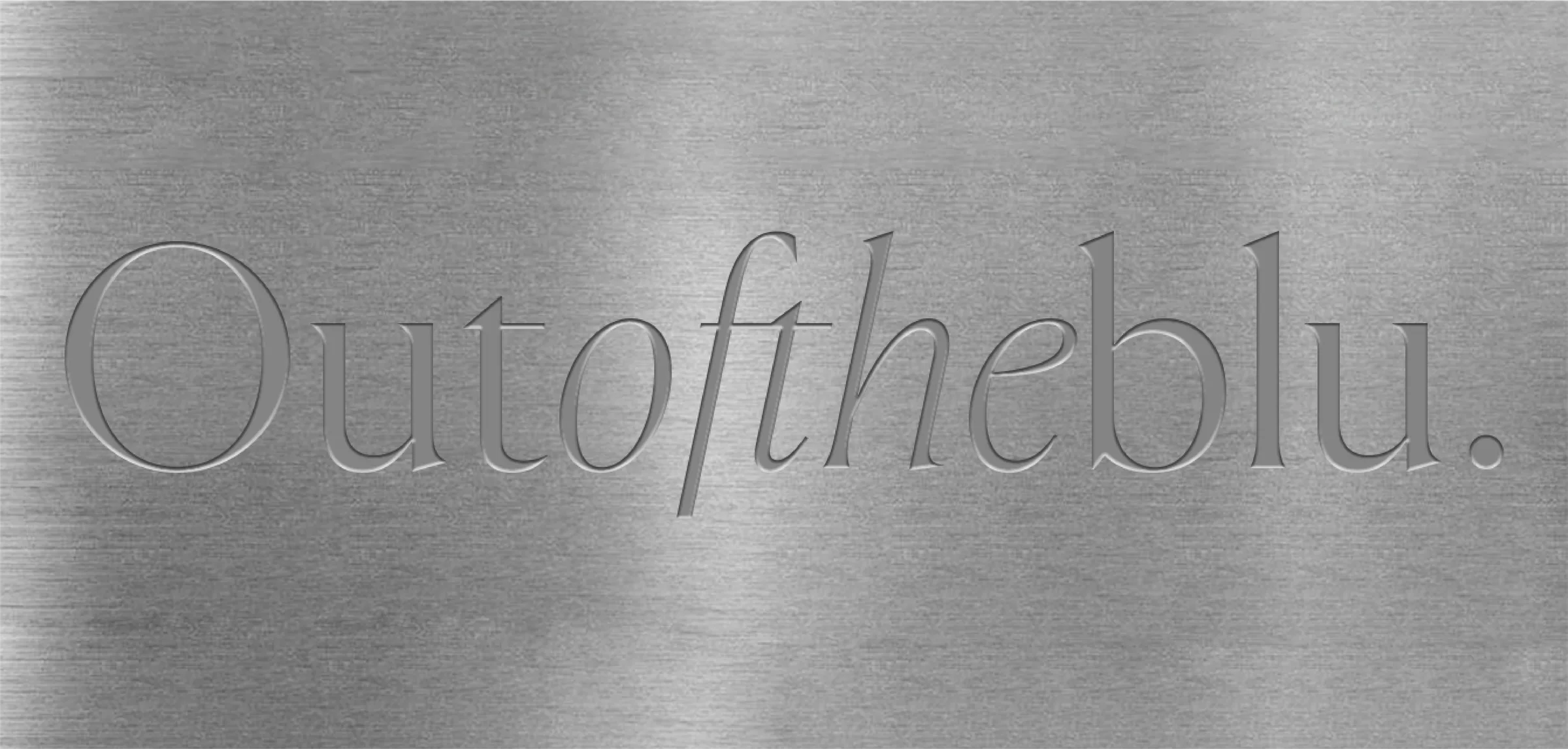
Blu: identidad 2025.
A new chapter for Blu: a rebrand that transforms its image, strengthens its identity, and reflects creative and strategic maturity.
After several years of steady growth, Blu introduces a new chapter in its story: a rebrand that not only transforms its image but also reaffirms its identity. The most evident —and symbolic— change is the decision to reclaim blue. For years, the agency avoided the color, considering it an obvious association with its name. Today, in a stage of greater maturity, Blu embraces a bold electric blue, building coherence between its verbal and visual expression.
One of the most distinctive elements of the new visual system is the use of metallic and chrome materials, integrated as a central symbol of introspection and perspective. Like a mirror, these materials invite reflection — to think, question, and create with depth. The logotype was also refined with subtle adjustments, adding sophistication without losing its essence.
Beyond the visual aspect, this rebrand places special emphasis on Blu’s internal culture. The new brand voice is more direct, mature, and straightforward — a faithful reflection of how the team thinks, works, and connects. This evolution comes with key adjustments in processes, services, and operations, preparing Blu for a stage of accelerated growth, international positioning, and talent attraction.
This is not just a new look. It’s a statement of where we’re headed.
Project team: Robby Gonzalez, Isma Zurita, Pau Villarreal, Gaby Elizondo
Explore More
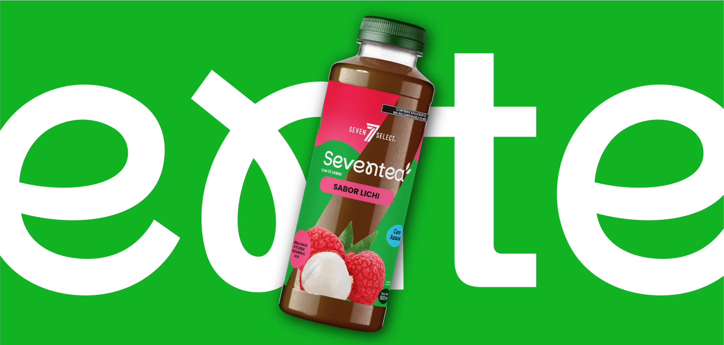
Seventea
From concept to shelf, creating a new tea experience for Seven Select.
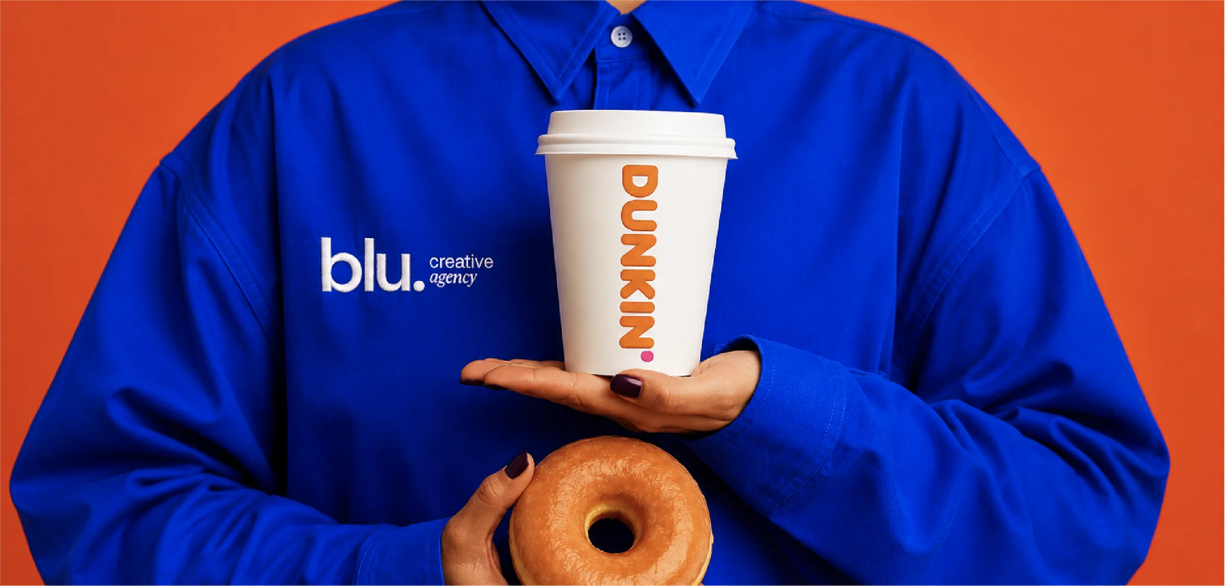
Welcome Dunkin'
Welcoming Dunkin’ México as our newest creative partner.
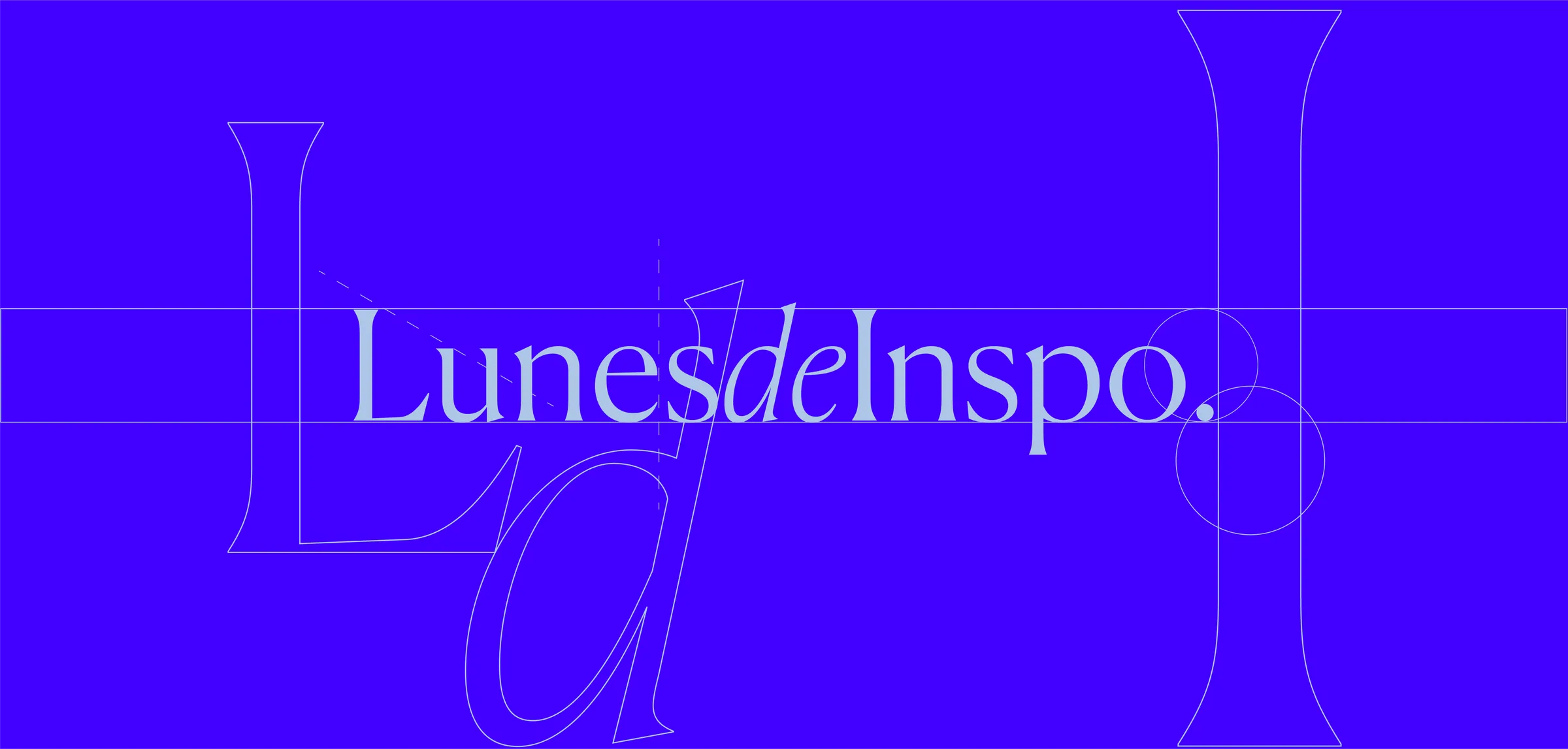
Lunes de Inspo: inspiración colectiva como hábito creativo.
A cultural practice at Blu that fuels collective creativity and strengthens the team’s visual and critical thinking.
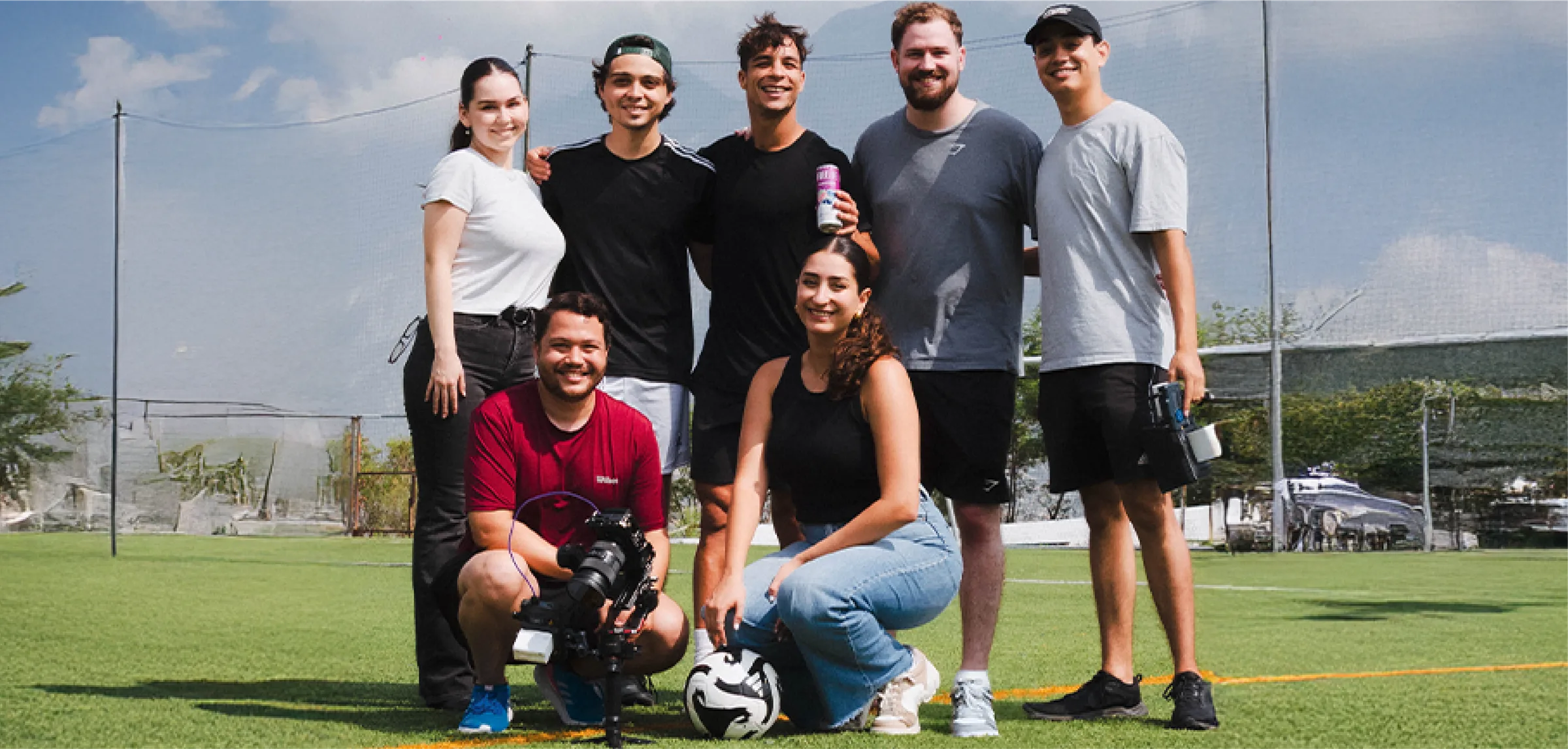
Oliver Torres se hidrata con Freelife.
An authentic collaboration merging sport and lifestyle, positioning Freelife through Oliver Torres’ real routine.